The average consumer spends less than 20 seconds making a retail purchasing decision – that’s a small amount of time to make a winning impression! And, in the booming nutraceutical market, you are also competing with a growing number of brands to draw the buyer’s attention. With such a narrow window of opportunity, it is vital that you have a unique, effective, and targeted supplement label design. The following steps can help your team develop a design that will captivate potential buyers.
Here's five simple steps to designing your supplement label:
Preliminary Steps
Start with your target audience
Let’s start with your brand and marketing strategy. Does your brand have at least one target audience?
A target audience depicts a group of consumers with shared demographics such as age, gender, income, lifestyle, or geographic location, as well as psychographics such as interests, motivators, and pain points. It also outlines how and why they buy.
Select your packaging or label material
Before entering the design phase, you should have selected your primary packaging, label or pouch format, materials, and print method. It is important to be aware of your chosen construction’s unique print capabilities and potential design limitations. If you don’t know this, don’t fret – the team at Brook + Whittle can help you determine what’s possible and give you the confidence to move forward with supplement label design.
Step 1: Make a checklist of packaging elements
Most nutraceutical brands begin this process by deciding what items require a design. The following questions can help you figure out how much real estate you have and where you should focus your efforts for maximum impact:
For pressure sensitive labels
- How much area will the label cover?
- What content should you prioritize on the front?
- What information should go on the back?
- If using an extended content label, what content should it reveal?
For shrink sleeves
Our team of experts will send an art template for your shrink sleeve project that outlines the height of your labels and any areas of high distortion. You should avoid placing important copy in these areas.
- What content should you prioritize on the front?
- What information should go on the back?
- Where are your perforations placed? Do you want copy or branding above these perforations?
For flexible packaging
You will receive an art template for your flexible packaging project from our team, noting zipper placement, tear notches, and other features.
- What content should you prioritize on the front?
- What information should go on the back?
- Are there tear-off portions consumers might throw away after opening your product? Do you want copy or branding placed there?
Step 2: Determine the necessary content and information to display on the packaging
When purchasing a product, especially an ingestible supplement, consumers want to know what it does for them and if it’s safe. Clear communication about product ingredients, directions for use, and safety considerations is vital. These are all key components in creating peace of mind for the consumer and building brand loyalty and trust. Before designing your label, list all required and voluntary copy that you’d like to include in your design. This may include:
- Unique selling points and promises to your target consumer — Due to limited copy space and a short window of time to attract a buyer’s attention – it is best to keep this statement short and sweet.
- Required statements — The FDA requires all supplement products to display the following information on its packaging:
- Identity
- Net Quantity of Contents
- Supplement Facts
- Ingredient List
- Name and Address of the Business, Manufacturer, Packer, or Distributor
This blog post outlines the FDA label requirements for dietary supplements to help you create packaging that meets legal requirements.
- Other beneficial information — You may want to include usage directions, warning statements, or storage suggestions in your supplement label design. This information can increase brand transparency and boost consumer trust.
Check out this blog post on voluntary statements for nutraceutical labels to determine what additional information to display on your packaging.
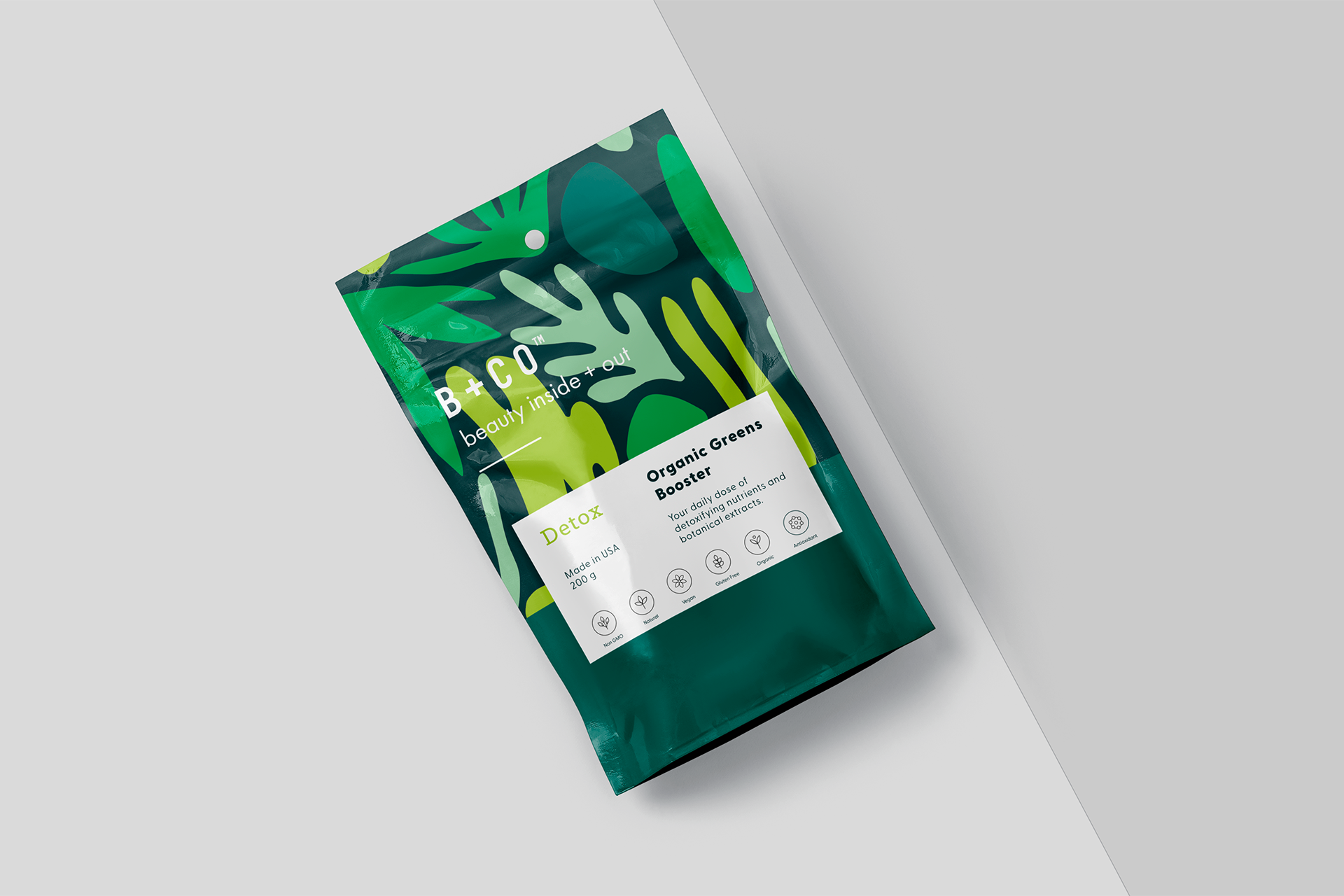
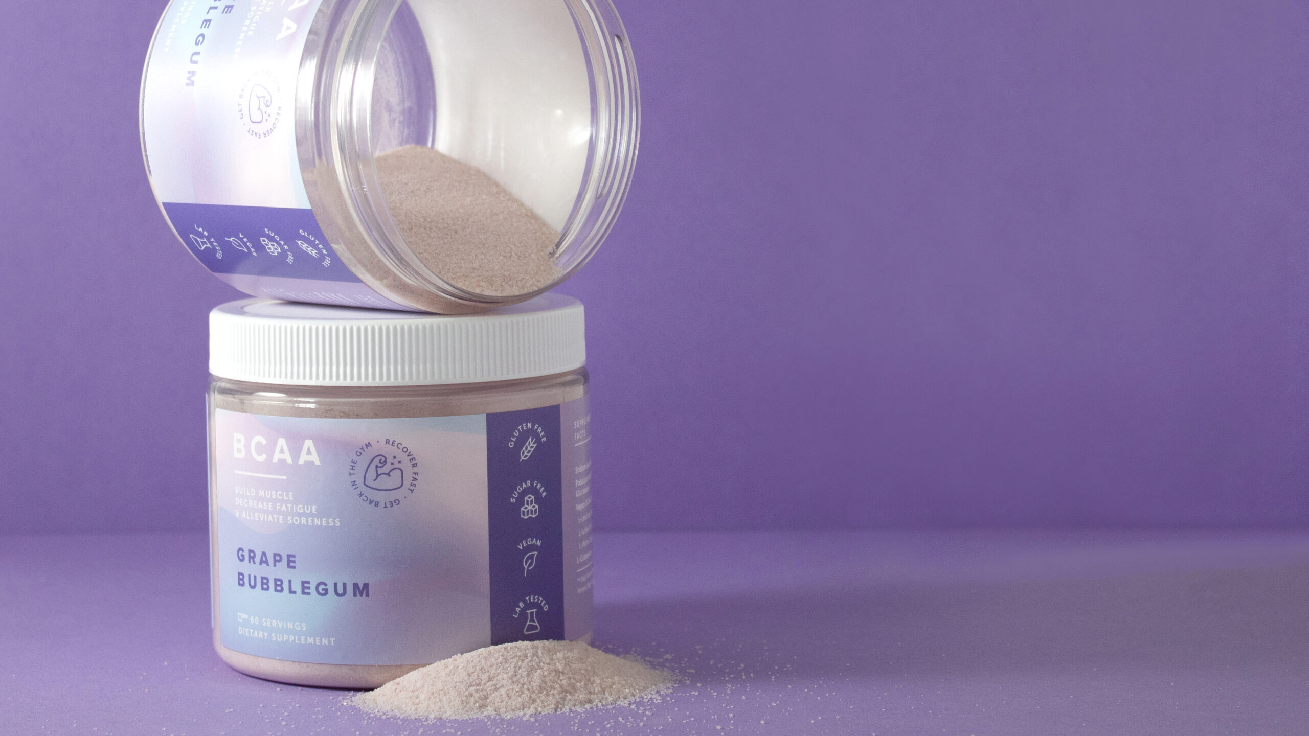
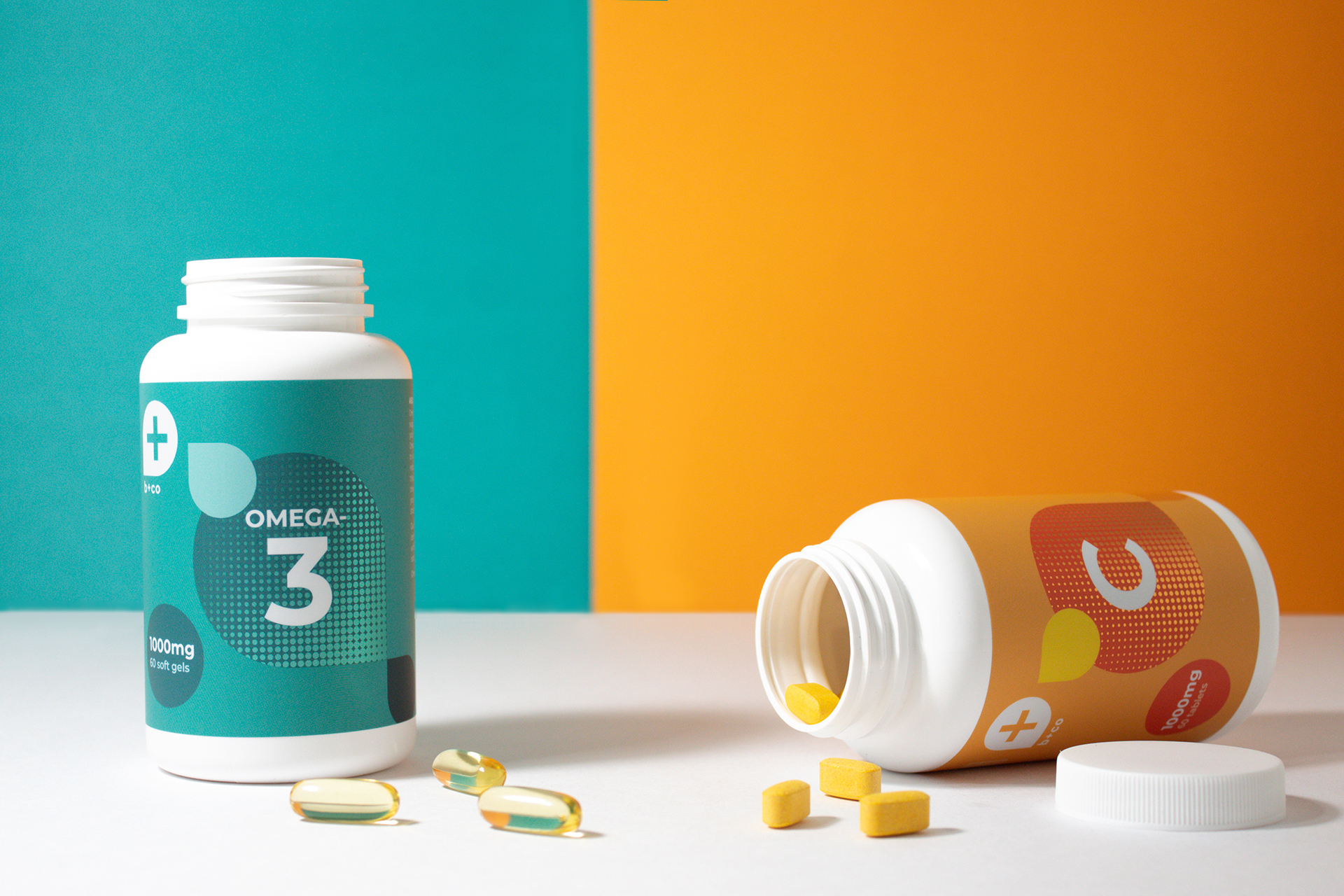
Step 3: Identify design elements that speak to your target audience
Now, think back to your target consumer. What overall design style would draw their attention? Would it be a natural, organic, sustainability-focused design? Would they be drawn to a clean, minimalistic design or a bright, bold, graphic-heavy design? By defining the “feel” of your label, you’ll have a foundation to build on throughout the design process.
After determining your overall style, you can then identify specific elements and characteristics for your label design. Note that elements such as the number of colors and embellishments, as well as line thickness and type size, can be limited.
- Colors — What colors do you want to incorporate? How do these selected colors enhance and complement your chosen design style?
- Graphics — What, if any, photo-quality graphics do you want to showcase on your packaging? Do these graphics strengthen the messaging behind your product, fit brand appeal, and effectively capture the attention of your target consumer?
- Patterns — Would any patterns or designs appeal to your ideal buyer?
- Icons and symbols — Are there icons or symbols that identify key benefits of your product? Some examples of this may be gluten-free, vegan, or cruelty-free symbols.
- Illustrations — A picture is worth a thousand words. Could illustrated instructions be helpful for users of your product?
- Embellishments — Would the use of any embellishments enhance shelf appeal and attract consumer attention? You may want to consider foil or glitter, matte or gloss varnishes, or metalized films with a white layer.
Step 4: Start designing!
Once you have your design plan, you can begin crafting your supplement label! Below are some elements to review:
- Information hierarchy – What product information is most important to display in prominent locations? What information must you legally place in specific sections of the label?
- White space – Is there enough negative space in your design to allow the eye to easily scan your product? Is it clear which design elements are grouped together, and which ones are not?
- Typefaces, fonts, and letter size – Do the selected typefaces, fonts, and letter formatting suit your branding and target consumer? Do these adhere to the FDA text formatting requirements?
- Colors – Is there enough contrast between your chosen colors? Are the colors in CMYK? Are brand colors Pantone-matched?
- If utilizing removable packaging elements – Is there meaningful content that could be removed upon the opening of your product – such as copy or instructions on tear-off pouches, perforated shrink sleeves, or tamper-evident bands?
Ensure your art is print-ready
Step 5: Evaluate your work
After completing your supplement label design, it’s time to review. Ensure your work meets your desired marketing goals, that all elements are cohesive, and that it matches the construction of your chosen packaging.
We recommend a first impression test – put yourself in your target consumer’s shoes. Would your supplement packaging design effectively captivate and educate your buyer? Is there an appropriate balance between design and content? If yes – you’re ready to print!